


Do you remember a time before the ubiquity of mobile devices? For better or worse, the days that all emails were read on a desktop or laptop computer are well behind us.
That means if you’re not optimizing your content for mobile, you could be missing your best chance to impact a large segment of your audience. In fact, 69 percent of mobile users delete emails that aren’t optimized for mobile. If you’ve invested in developing a robust content marketing strategy, the last thing you want is for such a sizeable number of your prospects to toss it without a second glance.
Today, we’re taking a closer look at how you can optimize the design and content of your emails to reach your audience on any of their devices.
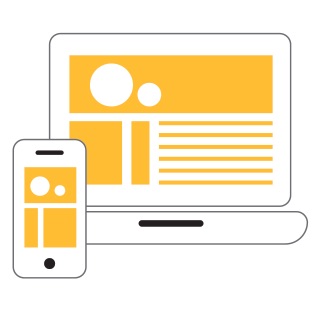
Given the prevalence of mobile, responsive design is the gold standard for both websites and emails. A responsive design will automatically adapt to differences in screen size, allowing you to present consistently impactful marketing across every medium.
Responsive design is especially crucial if you regularly use images, columns and templates in your emails. Unlike plain text, which people can more easily resize or scroll on a small screen, images and formatted templates are not easy for a user to control. When these elements of your marketing do not respond to your audience’s mobile devices, they look unprofessional and unappealing.
The good news is that web designers can easily implement responsive design with media queries. In some cases, your email platform will even do this for you, so it’s an important element to consider when choosing an email marketing solution.
Well-designed and well-placed calls to action (CTAs) are also key in optimizing your emails for mobile devices. While you can lose leads at any stage of the buying cycle, it doesn’t make sense to throw away potential users who are already engaging with your content.
To engage mobile users, you need to design your CTAs with touchscreens in mind. Buttons should be large, clearly identified and well spaced out from other email elements. This way, when a user presses the button, they will be taken to the link they want to visit, rather than accidentally pressing another element or needing multiple tries to engage the link.
We also recommend sticking to one prominent CTA per email to make it clear what action you would like your recipient to take. If you’re still not noticing the engagement you want in your emails, you can also optimize the effectiveness of your emails through A/B tests to decide what design elements and subject lines are most resonant with your audience.
For more tips on optimizing your emails for mobile, contact us today.
 (Click here to expand)